Cray Cray times
We were told to use “hip” language to be “with-it”. Last time I take advice from the resident 10 year old.
Busy days as usual at the Studio, and even though I have been prodding my dearest hubby and art-partner for days, he keeps on forgetting to update the blog.
Road to Jove is slowly but surely gathering a larger fanbase which is nice. Currently we have been creating and discarding quite a few concepts to introduce in the near future.
David in the meanwhile made this awesome propaganda poster for Fomoria which gives an insight into the wartime years of this mysterious country/alliance.

A rhythm in regards to Road to Jove is being set in the Studio, a bigger undertaking than initially expected.
Road to Jove deals with the aftermath of war, a theme so very much alive right now in Europe and the current crisis made it even more a burning issue.
So, remember that awesome music from the Road to Jove Trailer? (if not, you can find the trailer here.) An old friend of ours Ryan Northcott aka Mechanorecptor participated in a project which is already several years old called “Dance 4 Syria”. This is a compilation of some really awesome trippy music ànd most of all proceedings go to a cause to aid the Syrian refugees.
So for all of our followers whom have a dollar or a few to spare: You can buy the track here. Making the world a better place though art should be a goal we all aspire to.
Commissions:
We still have spots open for commissions. Feeling like you need an interesting piece of digital art? (Single character, simple background) Let us know! These kind of commissions help us evolve, quite often our clients give excellent briefs and have creative ideas regarding things we haven’t thought of. So take the chance 🙂
For anything outside of those specs, or if you need any information not covered here, go to the bottom of the About page and send us a message through the contact form, or just email us. The address is right up there, to the right of this post!
Please note that Studio Colrouphobia will not do any paid commissions based on any IP’s not allowing any reproduction and/or derivative work.
Style, to death II
Welcome to this weeks post.
How are you hanging in there? Due to a storm drawing in over Belgium we couldn’t post yesterday so let’s make up for it in style.
Last week we discussed Western style. We took up some contemporary icons of art and two artists who have a very distinct style.
This week we’d like to discuss Eastern style and some of the lesser known (in the west) styles.
When we say “Eastern” we are referring to Asia and East Asia. Please also note that this is in no way a comprehensive, or necessarily correct, discourse over Asian art. Just observations.
Asia
Asian artists have largely been unknown to westerners. To introduce them now would take far more time and space than what this blog can do in a single post. So let’s focus on a smaller part of Asia, East Asia. More specifically, let’s focus on China and Japan for this time.
To understand how style works in China and Japan, we need to understand some of the background of the art movements through time in these two countries.
China
China has always had a strong cultural drive. Whether in form of theatre, dance, music, pottery, or painting; there has always been a strong development of the arts.
When it comes to painting in particular, the Chinese have always had interesting ideas around it; i.e. ink has been a strong influence on art. In western art, black has on occasion been seen as no colour, or at the very least a colour that should never be used. The Chinese, on the other hand, revered black as the best colour. Black ink was considered to have all colours in it, and thus could portray all colours. To be able to do this the ink had to be “alive” and applied in varying tones to display all the subtetlies of the spectra. Other colours become secondary and the ink takes the centre stage.
As there is a very specific manner to paint with ink on a brush, the form evolved and is something that still nowadays can clearly be seen in many contemporary Chinese artists.
A comprehensive list of Chinese artists throughout history can be found here:
http://www.artcyclopedia.com/nationalities/Chinese.html
Japan
Whereas Chinese art was always bound by traditions and evolved under strict circumstances to evolve into something perfect, Japanese art has had a number of influences from both mainland East Asia and the western world. The Japanese also took things to it’s extreme many times, for instance evolving the sumi-e in much the same fashion as the Chinese evolved their inkbrush techniques, but at the same time it could be influenced by the west, as with ukio-e, landscape paintings that where very common in the Edo-period.
Some basic knowledge about Japanese artschools and artists can be found through here-
http://en.wikipedia.org/wiki/List_of_Japanese_artists
Classical examples
A quick rundown of some of the most notable historical painters from East Asia:

The Great Wave – Hokusai

Woodblock print, album leaf. Popular culture. Young man and woman in a roundel of maples and cherry blossoms. From an untitled album. Beni-e on paper.

Riding Mule in a winter forest – Lee Cheng
Modern examples
So when it comes down to modern art then? Most of you will recognize anime/manga as a style, and possibly have heard about artists such as Ai Weiwei or Aguri Igarashi.
Whereas Ai Weiwei does make interesting art, it hardly comes in mind for what we are looking at: pure painting/illustration. And whilst Anime and Manga are interesting, there are tons of interesting articles online about how to make your art look so.
So here are a couple of interesting artists that you possibly will know and that I would like to add for their distinct style:
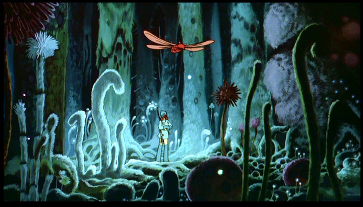
Nausicaa – Studio Ghibli
Whereas Studio Ghibli undoubtedly is an Anime studio, there is something specific and precise about the style which is lent by Hayao Miyazaki. This is more about design then style, but the daring manner with which he blends traditional and new concepts to create something new make it feel less like manga/anime and more like little perfect stories, filled with anything your imagination can manage, and more.

Sun Wukong vs Demons – Fenghua Zhong
Look at the textures, and the colours. The amount of natural occuring textures in this piece of art make it almost unfathomable that it is actually a purely digital piece of art. Fenghua works as a conceptartist and freelance illustrator. Specifically the manner with which the almost colourless and monotone colours come out as vibrant and diverse is interesting.

Flute player- Ruan Jia
Ruan Jia is a master with colour and tone by mixing colours of contrasting hues, but making them work because the tones are so close. Take a closer look at the eyes of the above illustration. Notice how the predominant colours around the eye, the eyelid, the brows, the lashes, and so on, are cold. Either blue or green. But that the eyes themselves, what little can be seen of them between the eyelashes, are pinkish/orangey-red. These things make the painting come alive with life rare to see outside of a master oilpainting.
So that’s a quick look at some Eastern Styles that are worth investigating. Do you have any other artists with styles you find unique or worth looking at when it comes to exploring your own style? Let us know in the comments!
Next Week
Next week we will take a look at how we can use the Western and Eastern style-examples we have looked at to help further, and find our own unique style.
If you have any suggestions on artists we should look at please let us know through the comments below, or through our Facebook page. or Twitter Page (dont forget to hashtag with #dontfeartheclown on Twitter!).
Commissions
If you are interested in private commissions we have three slots open this week.
For more info and contact, go to the bottom of the About page and send us a message through the contact form.
Tell us what you think about todays blogpost. Use the form on the about page (link in sentence just above this) or through our Facebook page. or Twitter Page (hashtag it with #dontfeartheclown) We’d love to see your input!
Style, to death…
Welcome to a new week.
This week we would like to start to discuss style.
Style has been talked about by numerous artists, art directors and fans of art on so many occasions that it could be considered to be a done-to-death-topic. Nevertheless we’d like to bring it up in a two-part blog to showcase some of the more interesting styles out there that do not fully fall within the mainstream of western culture. At the end of these two articles (or possibly in a third installment) we will discuss what we can take with us from these different styles and see if we can use it to further our own styles.
This week and some other articles on style
This week we will talk about Western artists and some styles of Western origins. Next week we will bring up some Eastern artists and their styles.
For some interesting articles on Style in general, there are some to be found through Muddy Colors.
Here are a few:
http://muddycolors.blogspot.be/2012/06/style.html
http://muddycolors.blogspot.be/2014/06/honing-your-vision-ruminations-on-style.html
http://muddycolors.blogspot.be/2013/05/walt-disney-on-pursuing-style.html
Western Styles
When it comes to western styles, these ae the styles that most of the readers of this blog have grown up with. You see it on a daily, or weekly, basis. You have seein it in comicbooks, storybooks, museums, and game-art. These are the ones you all know about, and if we mention just a few well known examples you will immediately have an idea of what they would look like.


To mention some of the contemporary ones.
The above artists and their styles have already had a huge impact on western styles in general. In some cases, like with Frazzetta and Jones, their respective styles have influenced whole generations, where as the others are inspiring on a grand scale, even if they might not have influenced entire generations. These artists, of course, stand on the shoulders of their own artheroes, whether early 20th century american popular artists like James Montgomery Flagg or N.C. Wyeth, or earlier masters ranging back in time to El Greco and Fra Angelico.
Point in case unique styles
Let us take a moment to mention two artists with unique styles that are worth taking a closer look at.

Rocketeer – Mike Mignola/Dave Stewart
Mike Mignola has a very distinct style, based mainly on solid fields of colour or shades.
Visible in his Hellboy-series, the most prominent part of the style is how black and white is used to create drama, often the “white” areas are filled with a solid colour (mostly aptly added by Dave Stewart) to create different ammounts of shade. Mignola also uses a very bold sense of shapes. His characters could almost be seen as charicatures with their oversimplyfied traits, more so then most comicbooks. But it is a great style because it conveys a lot of feeling. The bad guys look bad already at first glance. The Good guys (and gals) are very evocative in how they look and the style shows how every persona feel very well just through poses and how they are drawn in any given situation. Mignola have also mastered texturing in this style. Often making extraordinary large beasts look like they where made out of concrete or some sort of stone-material. Esotheric or non-physical beings, beams, or energy is often illustrated in a very solid fascion, but the way Mignola adds texture will tell the viewer that this is something special.
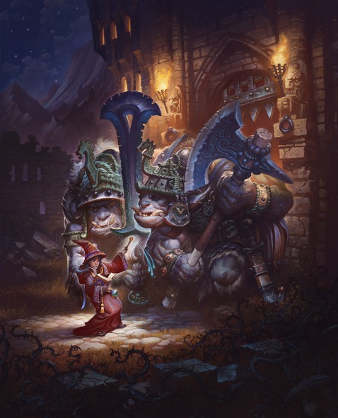 Spells Are Hard – Justin Gerard
Gerard has a playful style, filled with humour. Where most illustration today is moving towards more realism, Gerard manages to make his illustrations not only have an element of humour but also mintain a very good sense of colour and saturation. Gerard also mixes traditional sketching an painting with digital very effective, often giving his works a very nice textured feeling. To an extent one can see the same playfulness and humour as in the works of Paul Bonner, but where Bonner works exclusively with traditional mediums, Gerard has learnt to take full advantage of both traditional and digital mediums.
When going to see Gerards works, be sure to also take a look at the works of his wife, Annie Stegg Gerard, who is an accomplished artist as well.
So that’s a quick look at some Western Styles that are unique. Do you have any other artists with styles you find unique? Let us know in the comments!
Next Week
Next week we will take a look at some eastern artists, both contemporary and historical, to see if we can use them to help further, and find our own unique style.
If you have any suggestions on artists we should look at please let us know through the comments below, or through our Facebook page. or Twitter Page (dont forget to hashtag with #dontfeartheclown on Twitter!).
Sketch and a WiP
Here is a sketch for the next Primarch and a WiP of the illustration for the Ars Scribendi winner. Next week we hope to be able to show you even further evolutions of these two.


Commissions
If you are interested in private commissions we have three slots open this week.
For more info and contact, go to the bottom of the About page and send us a message through the contact form.
Tell us what you think about todays blogpost. Use the form on the about page (link in sentence just above this) or through our Facebook page. or Twitter Page (hashtag it with #dontfeartheclown) We’d love to see your input!
What you need and what you want….
Hello there,
Welcome to yet another blogpost. It’s been another week and it was a busy one.
Several deadlines converged in short succession and as such there are a lot of finished illustrations, but alas little to show until they have been published.
Because of this, we thought we’d show you some general goodness on, and for, artists.
For the artist (and client)

Artpact.com is a tool to help Freelance Fantasy, Sci-fi, Comic book, and other illustrators negotiate a better living for themselves.
It is easy to think that life as an illustrator is great.
A lot of people approaching us in regards to our studio and working as artists or illustrators have this belief that we have all the spare time in the world, that all we do all day is exactly what we want, that it is easy, goes faster then a blink of an eye and that we roll in cash.
It really is not like that at all. In fact, it is all hard work. Often working with illustration means you have to paint what others want, not what you want. Deadlines are tight, you can’t display what you painted (sometimes up to years after you painted it). And this belief that it is simple, doesn’t cost much time or effort, and so should be more or less for free, mean that even p-professional clients have rules and contracts that make it even tougher to survive on being an illustrator.
Artpact.com is there to help the struggling artist.
But even if you are just interested in commissioning an artist, we suggest you go and read some of the articles there. Our suggestion is these two articles:
The Cost of Being an Illustrator – To give you an insight in why commissions cost as much as they do. There are costs for running a business, and before we even brake even, these costs must be deducted.
Dealing with Difficult Clients – Here you will find things you should try to think about as a client. We’re all humans, but these are some of the things that make artists feel less happy about a commission. And in the end, making sure to avoid these things will make your commission end up much more like what you had in mind.
On art and artists

Muddy Colors is a place that’s all about art, artists, being an artist, being an art director, or just appreciating art.
If you are interesting in anything in regards to popular art, chances are that you will find something about it here.
The blog-posters are all illustrators, sculptors, 3D-artists, art directors, or gallerists. Dan Dos Santos, Arnie Fenner, Terryl Whitlatch, Lauren Panepinto, Greg Manchess, to name a few of them, are all very helpful in showing bits about art in all its forms, whether you want to work as an artist, hire an artist, or just appreciate good art.

Feng Zhu Design School Cinema is a Youtube channel that gives insights in what it’s like to work as a concept artist. With more then 70 episodes, most longer then half an hour, this is a vast source of inspiration, help, and insight in what it means working in the entertainment business as an artist. And if you just want to paint for fun, just watch as Feng Zhu and his guest-instructors paint, talk about things like composition and colourtheory. You should be able to find just about anything on the technical aspects of painting and illustrating, as well as conceptualizing, except for the foundations. This is something Feng Zhu teaches at his school in Singapore. And even some foundation bits can be found here and there.
Whilst you’re at it, go check out Feng’s own art gallery initiative, in the wake of the loss of CGHUB, DrawCrowd. You might find some art you never seen before.
Commissions
If you are interested in private commissions we have three slots open this week.
For more info and contact, go to the bottom of the About page and send us a message through the contact form.
Tell us what you think about todays blogpost. Use the form on the about page (link in sentence just above this) or through our Facebook page. or Twitter Page (hashtag it with #dontfeartheclown) We’d love to see your input!
Sketches, it’s all about the sketches…
Hi there,
Time for another update!
We hope you enjoyed the week that passed and that a good week is ahead of you.
Lesser art?
This week we would like to show some sketches and lineart.
Now when you think of sketches and/or lineart there is often an automatic dissmissal of them in comparison to illustrations or renders.
These sort of generalizations are commonplace in almost any form of artistic or creative works.
Theatre is better then the movies, opera is more cultured then jazz, illustration is more sofisticated then sketches and lineart.
Quite the contrary, all of these forms have their value and are quite separated from one another as far as what you must go through to make sure it is complete and good, purpose and result.
As such, a theatre play might demand alot of the acotr’s skill to portray the feelings of their character clearly to an audience, whereas the actor in a fil can rely on more subtle displays. Opera has a certain story and background that weigh in on how the music is experienced whereas jazz is based on feeling and interaction with the crowd.
Sketches
When it comes to sketches, then, they are as varied as there are reasons to make them. Sketches can be instrumental in finding design, meant as training, to act as support for an illustration, or simply be the base of a painting. A Sketch can be a very clear image, going to an almost illustrated finnish, or it can be loose and wobbly, relying on the feel of it, rather then anatomical or visual accuracy.
Lineart
Likewise, Lineart has its place as either an artform in itself, there to supply support for an illustration or a base for a painting. Often a piece of lineart has sketches made as a base, but this is not always the case.
Here, then, are a couple of examples:

Lineart, Khan the Destroyer. Natasja is exploring this character and a couple of others in the style of lineart with ery simple colours.

Study/Sketch of a Dwarf, intended for future illustration or painting. The intent is to get the character and the feel of him down in these lines, to better paint or illustrate it fully at a later time. Whereas Natasja drew this sketch, it might be either her or David who will end up painting or illustrating this in the future. Collaborations like this can have a major role in improving ones skill and ideas for design.

Groot. Though not yet complete, this is an illustration. The idea was to take the character and illustrate it/him without adhering or copying the style of any other artist.


And finally, three examlpes of sketches.
The first one is a colour sketch trying to explore a character. The second is a more detailed sketch trying to get some more details into the character, and the third one is a base sketch for an illustration. The object of the three is the same character, and they are all sketches, but done with different goals in mind.
Next week
Next week we might bother Aaron for a quick pop-by to talk about why he thought it might be a good idea to team up with David for their sideproject
We’ll see if he has the time for it, and it might just be very mysterious and silent about exactly what it is.
Commissions
If you are interested in private commissions we have one slot open this week.
For more info and contact, go to the bottom of the About page and send us a message through the contact form.
Tell us what you think about todays blogpost. Use the form on the about page (link in sentence just above this) or through our Facebook page. or Twitter Page (hashtag it with #dontfeartheclown) We’d love to see your input!
Gone fishing…
Hello there,
Welcome back to another update. This week we will let you see some process images on how to find concepts through randomness.
Throwing the net
So you’re trying to figure something out. A concept.
It doesn’t have to be concept art that is the ultimate goal. Perhaps you are exploring charachters, creatures or any form of machinery as part of a larger illustration you are doing.
How do you actually get from “I have no idea” to a complete concept?
A long time ago, when we started doing this as a sidejob, Andrew Jones said “You throw out a net and reel in the concept“.
Let’s see if we can show you an example of it.
The small fish
David Started this by using Alchemy.org, a free program for getting random shapes. You can use any number of random shape-generating programmes, ranging from fractal programmes to zbrush and even specific randomizing brushes in Photoshopp or Painter.
The beauty of this particular programme is that you do not have to know how to paint or illustrate to get somewhere, you only need to try to get random shapes that resemble something. The artistic part comes when you start putting together more complex pieces. Here are some of the first shapes.

These are just random shapes that came out after playing around with Alchemy for a while. Though there are six on this particular sheet, David came up with closer to fifty different shapes that he collected into one file.
Catching the medium-sized fish
So now we take these shapes into Photoshop (or any photo-editing/illustration programme of your choice) and start putting them together in interesting ways. In Photoshop, David cut and paste the shapes on top of one another. Moving things around, turning and flipping and sometimes even erasing to get more interesting shapes.
The idea is to get a silhouette of that looks robotic, but what exactly is not certain at this stage, so David is going for various things, ranging from quadroped robots, to biped robots. Tall and slender to short and robust. The key is the silhouette. The details inside the silhouette are bonuses for later, when we detail the concept.
The addition of colour can help make parts stand out; This doesn’t neccesarily mean these parts will have that colour in a final illustration. The colours can represent anything from actual coloured panels, to lightsources, beams, special areas of some sort that will look vastly different on the final concept/illustration but that for now just need to be marked out as “special”.

So the sky is really the limit here, these above are the first groups David put together. He then made a couple of more, and started combining them together.
The bigger fish
After putting the first few shapes together, David have some basic robotic shapes. It is very easy to stop at this point and be happy, and some of the best concepts can be done at this stage, but it feels a little stale, so David combine this group of ten simpler silhouettes into some more complex ones. Not all work out, and it is important to be selective about the silhouette at this point. If two look the same, look at which one feels the most interesting as far as details go. Discard the other, or save it in a separate file for usage another day. Eventually, we havet six variations that can be used for illustrations.
Here is one of these simple bases:

And from there we can make an illustrated concept, or go straight to illustration, if it feels like everything needed is there.
The big fish
So here is a sneak-peek of something that will come out of this particular fish-net (not based on the above image, but something else).

This is meant for the project David and Aaron Debski-Bowden is putting together and we are hoping to be able to show you much more before the end of the year.
Hopefully this introduction to concepting gave you guys some ideas and motivation to go out and practice. We would love to see links to your own concepts, practice or otherwise!
As always, you can find things through social medias, so keep an eye out for updates and sketches on Facebook,Twitter, and Tumblr.
Commissions
If you are interested in private commissions we have three slots open this week.
For more info and contact, go to the bottom of the About page and send us a message through the contact form.
Tell us what you think about todays blogpost. Use the form on the about page (link in sentence just above this) or through our Facebook page. or Twitter Page (hashtag #dontfeartheclown) We’d love to hear your input!
Whoohoo, we’re rich…or some such…

Life is getting back to it’s normal routine after vacation. Mails have been piling up and some sorting needed to be done. Amidst all the junk and commercial mail we encountered a message from a certain Nigerian prince indicating we are his only relatives and we can inherit a fortune if only we give our bank-details…wow 🙂
First reaction was one of amazement: that mail is still doing the rounds? That felt rather comforting, almost like meeting an old acquaintance, like somethings never die and the internet, despite it’s fleeting character, has some consistency to it. Next conclusion: wow, they must’ve finally ran out of e-mail-addies and doing the rounds again in case they missed some the first time around 🙂
With this mail and the following S. Adams quote (yeah the Dilbert guy 🙂 ) we came to the conclusion that we have gotten some pretty bizarre requests during the years and thought we might share some gems with you. We shall call this category:
I get mail; therefore I am. (S.Adams)
Here are a few questions received by David:
- “I have a loose idea: essentially I want you to paint me violated.” We respectfully declined this one.
- “She should look like she is in agony, not having an orgasm.” Alterations to the piece were made. Up to this day we still cannot see what the client saw 🙂
- “If you paint it in gray-scale, I can colour it in later.”
And here a few from the canvas scene as reported by Natasja:
- “If you paint on paper and use watercolour, instead of oil on canvas. Will it cost less?” No, it is the amount of time spent that makes up the lion-part of the cost of a painting, not so much the materials.
- “Does it have to be this yellow?” (Was a desert scene, oil-painting photo referenced)
- “Do you paint nudes and can I pose? Photo’s do not do me justice.” Person was slightly to eager and overzealous to pose nude. Received naked images for quite a while there, each one captioned “this does not do me justice.” 🙂 Eventually no portrait was made due to clients financial situation.
Now these are just 0.01% of the mails we have received over the years as a studio. It is however remarkable how much more educated our clientele has become, the majority of our customers whether private or corporate are very clear and professional. Most communication really helps us in furthering our artwork. Of course we have grown into this as well, but recently we have not received odd requests and comments. But who knows, perhaps like the Nigerian Prince they will reoccur once and a while.
Anyways, what has the studio been up to the past days?
We can give another glimpse of the super secret Aaron & David project:

More details will follow, this is just an initial concept. Loads of concepts in the pipeline atm.
And number two we can share is the initial sketch for our Ars Scribendi contest winner (yay!) When this piece is finished we will dedicate an entire post to it. So stay tuned.

For our private customers, last week we had no takers for our discount commissions (mostly due to our vacation° so the last two discount slots are still open. They will vanish after this week, so be fast or they be gone 🙂
And now to quote Tigger: TTFN!
The ride of our life, and yours…
So another week, another post.
On Friday, we posted an extra update to let you know that the competition-deadline had past.
We had an amazing turn-up and so decided that the competition will return next year, albeit perhaps with a couple of more prizes, judges and other tidbits. We will be working for almost a year to be able to get the final format out for next years edition of Ars Scribendi. So thank you all!!!
We hope to announce the winner before our vacation break, so stay tuned. You peeps did not make it easy on us by entering so many awesome narratives!
If you have followed us for a while, you know by now that there is a studio Youtube channel, where you can see some of our processes. We have plans to evolve this to a little more then what it is right now, but it involves a bit of upgrades to programs and hardware, so if you can be a little patient with us there are some good things on the way.
Speaking of good ways on the way, here is a current low resolution view of the new Sanguinius that David is painting at the moment in his rare spare time:

And here is anothe little bit of good news.
We have had an exceptional year. Truly, this year has been a gamechanger for us in many ways. Most of the things are still under NDA (such is the fate of freelance illustrators) but quite some private commissions we have been able to show. In fact, we have had to limit the ammount of slots for private commissions this year, to be able to do proffessional work for companies.
We have a few things coming up that are absolutely brilliant, and David has a secret project that, once it get revealed, probably will get quite some attention. It will be new, it will be grand and the other persons involved are probably known by most of our followers, if not all.
So to celebrate our year, and to give some back to the community, we have decided to give a quite substantial discount for the five next private commissions we do.
The discount will be 100 Euro off of the normal price.
As pricing is a tricky business in the artists world, you will not often see prices displayed in public. There are many reasons for this, not least of all being the fact that supply and demand, as well as the level of skill of the artist in question, set the prices and therefore they can and usually will change as an artist get more famous, skilled or both.
So we will make an exception to this right here and now, and let you know our fares, just to give you an idea of how large our discount really is!
These rates are broad estimates, an usually end up being what we go for, but please keep in mind that what you want to commission can have an effect on the final pricing.
For one character, in a pose of your choice, with a simple (blurred or one colour, simple figures or structures of no real detail) background – 300 Euro
For one main character with supporting characters (up to three) with a simple, blurred background (as per above) – 400 Euro
For a more complex illustration, for example a battlescene with multiple focuspoints an a complex background – 600-800 Euro, depending on complexity
On the above prices, we will offer a 100 Euro discount, straight off.
To make sure we can keep to this and still work on everything we have, the discount will only apply for the next five commissions, so get in touch through our contact form and lets see how we can help you. It’s at the bottom of the “About” Page.
Please keep in mind that slots open this week are only two. This means that if there already are two commissions this week, yours will be pushed forward to start next week. Completion of a commission is usually 4-6 weeks on something simple and 6-8 weeks on more complex pieces. We will inform you of your deadline in the contract.
Follow us on Facebook.
Follow us on Twitter.
Follow us on Tumblr.
The end is nigh…
Friends and followers of Studio Colrouphobia: This week we see the deadline of the Ars Scribendi competition approaching. By Friday, at midnight GMT August 1st 2014, final entries need to be in. We have some really good entries already, so if you want to get a chance to have your narrative turned into an illustrated piece, printed and signed, to hang on your wall; this is the final week to enter!
Since this competition was such a success, we are looking into doing this next year as well, possibly with more prices, famous (or infamous) judges and more. We hope you liked writing the entries this year, and if you didn’t write, we hope you enjoyed reading the entries as much as we do.
We would also like to post a little something for you who wish to know more about painting and sketching. Below are two videos that illustrate the possibilities of the digital media and using photographs. It is quite commonly thought that all any illustrators do with photographs are to use them for paint-overs, cut and paste or using layerstyles to make patterns appear. But this is not all that is done. Mostly, photographs are just used as plain reference, so here David has used a photograph of a model dinosaur to first sketch the same dinosaur, and then to take it further by painting over the sketch and turning it into a dragon.
Note how not a single colourpick, nor paintover from/of the photo was done.
And here is the final image, taken about ten minutes more towards completion (total time spent 60 minutes): 
So what do you think? Have you got your own experiences in regards to using photos as reference?
This week we have two slots open for private commissions. You can make any inquiries at the bottom of the “about” page.
The makings of… a Primarch part 2.
Written By David.
In the second installment of this series, let’s talk about decisions and computercrashes.
So last time, we left with a fairly decent pose, as well as good set-up for the painting of Mortarion around the time of the Horus heresy.
A few decisions had been made in regards to how he would look:
-Similar to Curze (“siblings”)
-Scythe positioning
-Gaunt/ Deathly posture and features
– Details to keep in mind are: censers, no greenor white colours of armour, smoke coming out of the high collar, smoking pipes coming out of his back.
This is the image we had/

At this point, I do “the google rounds”.
Essentially, I look through google for images that I can use as reference for various items.
Items like hoods (monk-robes), roman shoulder-guards, freaky scythes, censers, smoke, fumes from burning oil-fields etc.
These things are ten stored for references. I will not se them straight off, but more as guides to how something is shaped.
If I need to create something unique for a character, I might “kit-bash” some of the images together to create interesting shapes (using various layerstyles in a similar fascion to how I started this illustration, see part 1 , but for this illustration that was not needed. (An example of an item that could have been made thusly, is the scythe, but I made a decision to paint that from scratch, based on pre-existing art.)
Examples of art that fell under references vary from Scythes from Darksiders 2, to conceptart for the Angels in Diablo to exhaust-pipes from Trucks and Holocaust-victims.
During this time, I also refine the previous image a little to get to the point where I like it a bit more. Not much is done beyond adding some backlighting, a few placeholder-censers and painting in the face a little.


So let’s stop here for a while and talk about catastrophical crashes.
I have made it a habit to constantly save iterations of my illustrations.
This way I can go back and copy-paste something that might have been better from a previous version, but I also make sure I do not loose hours of work if Photoshop crashes.
I have, to date, never had a version of Photoshop that did not crash on me at the worst possible opportunities.
Lately, I have also made it a habit to use a cloud-saving source to save my most recent works/files, simply because in case the computer crashes and files are lost, atleast some of my work is saved.
Better be safe then sorry.
So I worked on Mortarion for a long while. Each iteration of the illustration moving towards a goal.
The face was altered to focus more on his skeletal look, whilst maintaining a somewhat proxiation to my illustrations of Curze and Angron. I also used references of men from the Carpatian region as reference, to hint at the origins of the Legionaires (who are supposed to mainly have been recruited from this region on Terra, before recruitment from Mortarions homeplanet began).
Some alterations to the colours happened. The reds/oranges moved towards gray/blue/greenish to reflect this sensation of the sick and poisonous.
A shhoulderpad was begun on and the robes and scythe was worked out.
I had 8 preview-images to show on the blog. And they all vanished in a severe computercrash, loosing several folders worth of illustrations and references.
Luckily I had saved the ast two iterations of the image on my dropbox-account.
So here is where we come back to the image. It is not done yet, and there will be a part three, but you need to know why there was a jump in the look.
And a caution- save often. USe external harddrives or cloud-saving if needed, but make sure your work is safe.
Luckily, everything for my proffessional work was saved on an external harddrive except a new sketch, which means nothing suffered for commissions and proffessional works, but it could have been much worse, so keep this in mind!
Anyways. Mortarion was evolved

Now the astute viewer will notice a few things:
1) The pose is slightly altered.
This mainly comes down to the fact that the lower body is in shadow and the shoulderpad has to face a certain direction for him to be able to hold the scythe.
2) the collar looks completely different.
I went away from the crude stove-collar and moved towards a more knightly one.
3) Alot of the ornaments vanished from the previous image, including the censers.
During research, I found that Mortarion didnt fancy ornamentation, so I stripped it down. The censers where only really placeholders. They will return once I paint them in proper.
4) He is kind of stout/heavy set.
This, is fixed. Namely in the next preview image-

Following this I will be painting in the lower body, the scythe will be completed and the censers will appear After this I will start adding the gasses in an around the collar and finally there will be some colourcorrections and post-process work to make the illustration complete.
Let me know what you guys think.
Oh, and here is something Orky to end the day. Wprk in Progress:

/David
Studio Colrouphobia also has a twitter account: https://twitter.com/Colrouphobia
Studio Colrouphobia also has a Facebook-page: https://www.facebook.com/pages/Studio-Colrouphobia-Concepts-and-Illustrations/20588351315
