“Can I just use your images, like, however I want?” / Artworks to show.
So this is a dual post. It will start by making a point about posting other peoples artwork around the Internet without referring to the artist.
It will end with a couple of new artworks from the studio.
In a couple of days, there will be a new post with process on the Mortarion-piece, but today’s post is important.
So recently, it came to the attention of a couple of artists that I keep close contact with, that a certain Facebook-page is posting images.
Nothing bad about this, however, the page is notoriously bad at referring to the artist.
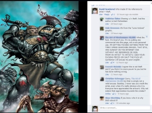
So the second comment sais it is Karl Richardson, which is helpful, however, the comments are really not where such a reference should be, they should be where the artwork is posted, in the description.
This is a quite serious problem, usually brushed aside by fans as not being a problem at all.
So let’s try and give a little insight in this part of being an Artist.
- FANS, this is for You! Take a good look and try understanding why this is important!
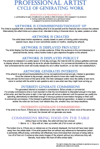
Let’s post this as an image. There will be a “free to use” disclaimer in the bottom of the image(s).
Please take your time to consider what each point say.
So what does this mean?
It means that whoever made the art you found cool and wanted to repost- tell us who made it! In the description of the art.
If you don’t know, the write that. That way, if someone let you know, you can alter it.
Does it mean that you will never be able to show any of Studio Colrouphobias works online?
No, it doesn’t. Of course you will.
But we would appreciate being asked. Sometimes our works are actually not for show everywhere. Some commissioners pay for more exclusive views. And we would demand a reference on the artwork, back to us, our website or facebook-page would be preferable.
It means that whoever made the art you found cool and wanted to repost- tell the viewer who made it! In the description of the art.
If you don’t know, then write that you don’t know. That way people can help you find out and, if someone let you know who the artist is, you can alter it.
You see, if we don’t get referred to then nobody will commission us, which also mean we will need to stop doing what we do.
And then there will be no art from us.
Everybody looses.
And now to stop on a more light note.
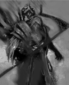
Here is a piece that Natasja has been working on on and off for a while:
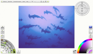
Being the more traditional painter of the studio, she is working mainly in Artrage, using some techniques She “learnt in the age of the dinosaurs, only now applying them on a digital canvas.” Images used for reference comes, amongst others, from National Geographics.
We hope to be able to show more of Natasjas work shortly.
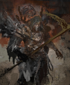
Also shown today, is the newest commission David completed.
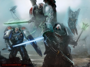
Until next time!
Studio Colrouphobia also has a twitter account: https://twitter.com/Colrouphobia
Studio Colrouphobia also has a Facebook-page: https://www.facebook.com/StudioColrouphobia
The makings of… a Primarch
So Halloween passed, thank you all for making it special by participating in ourcompetition.
Starting this week, there will be a new series of posts.
These posts are about following the creation of an illustration from concept to finish.
For the beginning illustration, I chose to use one of my personal Primarch illustrations.
I will go through wwhat ideas I have, how to flesh out the image, what thoughts and knowledge must be sought. Sketching, colour composition, painting roughs, using reference, when to use texturess and not and any number of other topics that come up along the way.
So let’s begin with the start, shall we?
For this particular illustration, I knew I wanted to tackle another Primarch.
But which one?
I have a list of Primarchs I am completing, where I have saved some general ideas and cool stuff to inspire.
Her’s what the folder look like:

You will notice that some are missing, which does not meant that they are completed, but rather that I haven’t ound anything yet to make me feel it is suitable to save as reference or inspiration for that particular Primarch.
So let’s choose one-
Let’s choose/
Mortarion.
It is, after-all, the season to be dreary.
So I look at what Mortarion has.
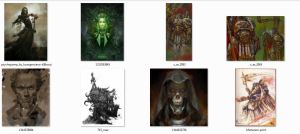
Not that much, but we can work with it.
So I do a quick sketch, without looking at my ref/inspiration images, but after I have looked at them/
So, its loose, crappy and not much to see. But it gives an indication, a hint at where I wan to take this piece.
Let me explain it to you.
Mortarion, for me, was always a riddle.
He grew up as a son of an alien (or a mutant, it seem to have shifted over the years). Taking control over the planet of Barbarus, a lethal place for humans to live and so poisons and poisonous gases are a part of his culture.
Likewise, the figure of Mortarion has this “Angel of Death” over it. A hooded figure, slender and agile, with hints of wings and a scythe.
The above is the way I think about Mortarion in passing, without investing any real tought to the character.
So the next step, is to look at the sheer physical aspects of Mortarion.
I did a Google-search, and ended up with a few images. I show them here to give you an idea, but I am in no means taking any credit fore these:
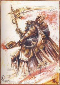 – John Blanche
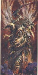 – Alex Boyd
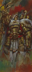 – Adrian Smith
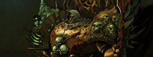 -Ibrahim Swaid ( http://holypixels.blogspot.be/2011/08/mortarion-work-in-progress-1.html )
So that’s the four first ones I got..
Now comes the choosing.
What do I like, what don’t I like.
I like the general features, the hood, the gaunt look of Alex Boyd’s version. The plain-ness of the armour. In fact, even though I usually really like Adrian Smith’s work, in this case, I find it completely out of tune with what I want to portray.
So I make a list of things to add in the illustrration-
Scythe (obviously, I even drew that in the sketch, before thinkking about it).
Hood (again).
Slender – like in the Alex Boyd image. – usually PlagueMarines are bloated, which is fine, but I want him to look like death/ This is not neccesarily going to be after he joined chaos.
Exhausts.
High Collar.
Censer- holding poisonous gasses.
Things to concider-
Colours, not sure about wite, or even green. I need to do some research.
Shoulderpads. I sketched something like the Angron or Curze shoulderpads, not sure if I will keep that or go with something else.
Smoke- I want poisonous gases to come out at the collar and from the Censers. Need to make them visible without looking lame.
Things to not take-
No Green, no White. Not on Armour in any case. I want him to be dull in armour/clothing. He will be pale, so he need to stand out a bit.
Chest from Hulk- I really need him to look like death, he cannot have the most powerful look, not bodywise in any case.
No face-mask.
Perhaps the fumes will cover some of his face, but I want his face to show mostly.
After writing these things down, I do a new sketch. And i failed (I lost the file). So I decide to do a tested methood when I need ideas.
I use an older image and duplicate layers, moving, reshaping, twisting and turning them around, using layer-effects to get “happy accidents”.
In this case, I used my Angron Painting.
This is the “sketch”:
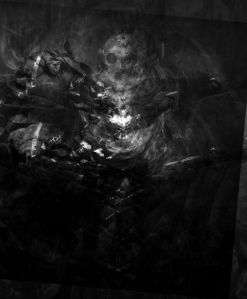
So I add some brushstrokes to give a hint at my figure (using the same pose as before)
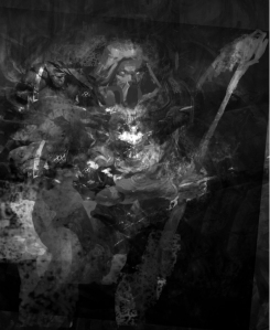
It still doesnt do it, so I do a little altering and adding a coloursplash, followed by a proper silouhete (next two images)
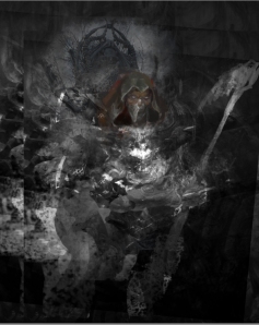
And after moving the arm and scythe, I am getting happy about the pose.
I know I said no facemask, but at this time, I am unsure how to make him look, so I have left the lower part of the face.
I will most likely make him look similar to curze, as I use roughly the same features for all the Primarchs, just changing them ever so slightly, to show they are siblings, rather then the same characer (or, indeed, completely different from one another).
That thing above his head?
Yeah, I dont know, perhaps I will keep it, perhaps not.
I thought I saw something like that in the back of Ibrahim Swaids Mortarion… it has potential. Maybe some sort of machinery, part of his exhausts…
We’ll see.
Till next time.
Studio Colrouphobia also has a twitter account: https://twitter.com/Colrouphobia
Studio Colrouphobia also has a Facebook-page: https://www.facebook.com/pages/Studio-Colrouphobia-Concepts-and-Illustrations/20588351315
On reference – part I
Hello there Studio Colrouphobia-followers!
Today I thought I’d take a little time to talk about how I use reference. There are many things to consider about references and many rules people
mention in regards to reference, so I thought we should discuss a little about it and I will also let you know how I use reference when I paint.
Lets start with the only rule you really should think about at all times. It’s divided into three parts.
Firstly:
If you are uncertain about copyrights and other rights- Shoot the reference yourself! Take a camera, locate a suitable view and take a
photograph of it!
The second part of the rule is:
If you bought a book with the reference in, and unless it say anything specifically about it on the image itself or on the publication-page (Where the information about edition and publisher and where it was printed etc. can be found) about using as reference , you can use it as reference!
And the third part of the rule:
When in doubt- Do not use as reference!
Now, before moving on to discussing other things, please do remember that the moment you use a piece of reference by cutting and pasting it into your work it’s not a reference any more- it’s a manipulation, manipulation wont bring you further towards being an accomplished painter or illustrator, it wont bring you anything but sorrow down the road (mainly because eventually people will find out and, rightfully, call you a fraud).
How I use reference and why
A lot of artists will say they do not use reference, or use it sparingly. I am not yet such an accomplished artist that I could do without reference though, and many of my illustrations defy life in such a way that using life as a base for painting them would only get me so far.
So I use photos to help me get certain things correct. It could be understanding a certain type of lighting, texture or shape of something. I used to copy photographs and drawings when I was young, it is an excellent way of learning how to sketch and/or paint, to copy something that already is well done.
But that was for practice. Nowadays I still do copies on occasion, though I would rather call them “studies”. Using a photo of an apple to try to paint a similar apple
(note “similar”, not “the same”). It needs to be believable, not a copy. I also do the occasional actual copy, trying to copy a work of a master such as Rubens, Caravaggio or Rembrandt to get the idea behind their work with colour and light, or to do a copy of a Pyle or one of the Orientalists to understand composition and how to use colours to strengthen it. But these are meant as practice, for me. They are not shown outside my family (and barely even that) and are not used for anything else but to further my own skill. A boxer need to shadowbox, an athlete need to run laps, painters and illustrators need to paint.
When it comes to actual illustration of something I use images, whether photos or other illustrations, as guides towards what I want to paint.
Consider Babar. If you have never heard of Babar: he is an elefant that grow up around humans, learn to walk on two feet and dress in clothes. Eventually he becomes king in his own land. A very nice set of children’s stories that teach basic ethics at the same time as being entertaining and sweet.
I have, for a longer time, been pondering to paint a classical portrait of Babar. He is a cartoony-like elephant, but only because the illustrated book was supposed to be for children, not education on the looks of elephants.
Since I illustrate with a certain amount of realism, and try to get to the part where seeing an illustration of mine is believing the illustration, I wanted to paint Babar a little more realistic. So I went about doing a little sketch of him:
This is my sketch: Babar, now an old king, sitting infront of a fireplace in a victorian styled chair sipping a Cognac. Behind him sits the head of Rataxes a friend and enemy (it’s a complicated relationship) of Babar’s. The size of the paper, and the fact that I had not truly planned this image much, mean that the head of Rataxes sit more behind the head of Babar then being visible.
After completing the sketch, knowing that I need to alter some things once I start painting it, I go about getting me some reference:

I find an image of a Rhinoceros, amazingly enough I find exactly the type of chair I wanted to seat Babar in, though not at the perfect angle, but still. I find three different elephant-heads, african ones, and I find a set of crown jewels (the Danish ones, but I like the Kings crown and it looks somewhat like the one I drew on Babars’ head).
I decide against using the elephants as final refferences, because I am uncertain where the images are from and whether there is a copyright on them. Normally, this would spur me to scour the internet for a massive amount of hours but my dear wife remind me that we have a zoo in the city, and that I have free admittance to it whenever I want to (one-year-subscription) and that, indeed, there are elephants there. Even though I will use the above elephants for my reference mash-up, I will still shoot new references to use once I begin the actual painting. (and on the plus-side, they also have a Rhinoceros or two at the zoo, which mean I might get some very nice photos of Rhinos as well, to use for this painting).
Now it’s time for a quick recomposition/colour-test:
In the above image, I have copy-pasted some of the references from above. I painted the clothes of Babar and the Head I had to paint because of the lighting but I did a lot of colour-picking. This stage is not really part of the painting itself, merely there to see if I “got it” or not. As such, it isn’t supposed to take that long. I believe I spent a glorious 30 minutes on getting the image above done. Obviously, the tone is very dark, but that is also partly because eventually I will look just as much on this image as the reference to get the final painting done correctly. The mash-up is meant to give a better understanding on the general look of the painting. The references are what will make the final painting come alive.
It is important for you to realize a couple of things here:
- This is meant to serves as a reference. I copy-pasted images in, to give me a better Idea on shapes. In the end, I might use the general tone of this, as well as using the photos copied into this document as reference, but I will paint the entire painting from scratch!
- I do not suggest painting over anything unless you really are starting out, and then only as practice! Don’t do paint-overs to get you “cool art that get me jobz”, because it wont. It will only tell people you aren’t good enough when they start putting pressure on you for deadlines and start seeing you painted over other peoples work, which in the end can cost them a lot of cash in the form of lawsuits and whatnot.
- I use reference as a visual guide, that does not men I have to stick to it rigorously all he time. There is still room for change along the way, but the reference is there to help me see things like light, shape, tone and texture.
Next time I come back to talk about reference, I will show you how I paint Babar from begin to end. With reusing the sketch as a base for the painting, painting under-layers and dead-layers, looking at the reference to get a good idea on what I need to think about with colour, lights and shapes/form etc. etc..
If you have any ideas on what to take up on this blog, or if you have any questions on this topic, other topics or such, please leave a comment and I will answer as promptly as I can.
I also wanted to know what you guys thought about Noah‘s guest-blog? Are you looking forward to the next art-hero to post one? Who are YOUR art-heroes?
Until next time,
David
Guest blogger: Noah Bradley – On the Shoulders of Giants
On the Shoulders of Giants
You don’t become an artist on your own.
Even if you lock yourself in your room and teach yourself, you’re still not on your own. You’re learning from the legacy of all the masters that have gone before you. You’re pulling on artistic traditions stretching back hundreds and thousands of years.
My art is heavily dependant on the artists that I look up to. I look up to my heroes and pick apart everything they did. I try and reverse engineer their brushstrokes, their compositions, even the ideas behind their pieces. When my art is feeling stuck I look to them for direction.
Rembrandt gave me an appreciation for rich contrast and thickly textural brushstrokes. Sargent showed me what artistic bravado really looked like. Albert Bierstadt taught me the meaning of epic and George Inness taught me the power of subtlety. Thomas Moran showed me an American ideal and Mark Rothko showed me the feeling of nothingness. Frazetta reawakened an adolescent boy and John Berkey inspired with his beautifully abstract representational paintings. Pyle taught me composition. Hopper taught me silence.
I have been blessed with countless teachers–some alive, most dead.
~Noah
This blog-entry is part of a series of Guest-blogs on Studio Colrouphobia called To be Inspired and Driven where some of the greatest influences on art today are invited to tell about their inspirations, their thoughts on art and their musings on anything related to art.
Noah Bradley is an environment concept artist & illustrator. He’s young but has already worked for an international clientele and has been accepted into the industry’s most prestigious publications. Even if you haven’t heard of Noah, chances are you have seen work he has done for Wizards of the Coast, L5R or AEG.
He is part of Awesomehorse Studios which do a great job of paying it forward to anyone and everyone who want to improve their skills and careers when it comes to art.
Noah Bradley is also the creator of The Art of Freelancing, a video aid to freelancers in art.
We here at Studio Colrouphobia did a review of this instructional video not that long ago. The review is found here:
The Art of Freelancing – a review with ducks
To be Inspired and Driven
Hello there Studio Colrouphobia followers!
Today there aren’t going to be any pretty pictures in the blogpost, but I hope the text will bring something interesting to you anyway.
In an effort to give back (something I’m sure you have heard before from others) here at Studio Colrouphobia we looked at our past, present and future to see what has been important for us when it comes to art and working as artists.
Pretty fast I personally came to the conclusion that there are two things that have and continue to, play a major role for me when it comes to working with art.
Inspiration and Motivation.
When I was younger, I thrived on visuals. I was into movies, comics and games, just like most others. But what really got me into things, where the visual aspects.
When I imagined things, the more I could visualize things in my mind, the more vivid they would become and therefore they would inspire me to explore that imagination.
My first true introduction to Art, as means to work with, actually came from the Swedish version of D&D. The images and illustrations where probably not the best, but I remember the creatures they depicted very well (and they all look perfect in my head now!) and I also remember thinking:
“Wow, the guys doing this are my dad’s age. Nobody I know my dad’s age would do this unless they got paid for it. They get paid to draw!”
I had always drawn and sketched, just like most others, though I was hardly the one two scribble on walls and scream if no pen or paper was around. I just enjoyed sketching and put enough effort into it for people to notice.
At a certain age I just decided that this, doing Fantasy and Sci-fi art, for a living, was what I wanted to do.
From there on, things become a constant battle between being inspired and getting motivation, drive, to continue. Most people have a really hard time trying to become a freelancer at anything, regardless of what you do. The reasons are many- people not believing in you, lack of money to pursue that sort of career, lack of self-confidence and lack of believing in yourself (and no, those last two are not the same – one mean you do not believe you are good enough and the other that you do not believe you WILL be good enough).
So how do you solve this?
Well for one, you need to have support from your friends and family, something I know doesn’t always happend. I had luck enough to have my -then girlfriend, now- wife that has given me support throughout the past 10-12 years. That’s not always evident.
The other things you need are great sources of inspiration and causes for drive.
I had great sources for inspiration. Before the internet (yes, I’m old) there where things like “Heavy Metal“- with giants like Simon Bisley, Frank
Frazzetta and Jeffrey (Catherine) Jones. There where Roleplaying-games, with covers and interiors just giving my imagination so much to use- I was inspired by Brom, Paul Bonner, Paolo Parente and Wayne England. There where book-covers with fantastically painted images -people like Boris Vallejo and Julie Bell as
well as Luis Royo just made me feel extremely enthousiastic about improving and possibly one day be able to earn my living on art, if I could only get good enough.
Once on the Internet, I got so many more inspirators added to the list.
Traditional artists such as Donato Giancola, Dan Dos Santos and David Kassan blew me away from the moment I either discovered them or found out who those book covers where made by.
Digitalists like Andrew (Android) Jones – for his innovating techniques, Björn Hurri for his fantastic dedication and commitment, J.P. Targete for his traditionals-looking digitals, Melanie Delon for her fantastic characters, Noah Bradley for his fantastic environments, Brad Rigney for his general excellence and so many more…
They all inspired me and gave me a drive to continue, to try to become good enough to work as an llustrator for a living. I’m sure most of you have sources for inspiration and motivation. I would love to hear who they are, perhaps we share them, or I haven’t heard of them or seen their work. I am still looking for more inspirational and motivational artists to add to my list to keep me driven to learn and improve.
Well, back in the days, I had to really look for these sources of inspiration and talking here at the studio we agreed that we should try and give back some of that inspiration.
To do that, I have asked some of my art-heroes and sources for inspiration and drive to write one-time blogposts, right here on studiocolrouphobia.net.
A lot of them are busy with their work, but some have answered an will write to give you guys some inspiration. I do not know what they will write, as I didn’t want to restrict them, but the general theme for these will be “To be inspired and driven”, and every blog-post made by a guest-blogger will be on the topic of Art.
We here at Studio Colrouphobia will post these as they come in. There is no a perfect schedule for when they will come in, but we will never post more then one a day, so if you have seen a guest-blogger post here, chanses are you wont see another update on that day.
We hope you will enjoy this little treat.
Did you know that you can follow us on Twitter and Facebook? Just click on the icons below to get to the right spot!
Until Next time!
The Art of Freelancing – a review with ducks!
So I thought I’d take the time to do a little review of the Art of Freelancing by Noah Bradley.
Let me begin by giving some background on Noah Bradley, for the rare occasion that you wouldn’t know who he is.
Noah Bradley is an environment concept artist & illustrator. He’s young but has already worked for an international clientele and has been accepted into the industry’s most prestigious publications. Even if you haven’t heard of Noah, chances are you have seen work he has done for Wizards of the Coast, L5R or AEG.
I first heard of Noah as part of an event on Conceptart.org, where he was described with(paraphrased):
“This guy came last year to the illuxcon convention, his portfolio wasn’t really that focused but he took the criticism and came back the next year and blew us away with his updated portfolio!”
Since then I have seen him around (or rather his work and his activities) on the internet. He is part of Awesomehorse Studios which do a great job of paying it forward to anyone and everyone who want to improve their skills and careers when it comes to art.
You should really check his work out, and generally, I tend to listen to any advice he gives, because he is not that many years further into his career than me, but he has attained success faster. He also seem to be a generally nice guy, which is always a plus.
That was a bit of background on the creator of the Art of Freelancing video.
So for the review-
Specs
For $57 you get
- a 5 hour lecture on freelancing (.mp4 format in a .zip archive | 422MB).
- Access to an extensive (and constantly updated) list of freelancing resources.
- Subscription to an exclusive mailing list that feature FAQs and supplemental content.
Noah also gives a 100% Money-back-guarantee on this product, should we in any way be dissatisfied about the purchase.
The topics covered in the Art of Freelancing are:
- How do I break into the industry?
- How much should I charge?
- What should I put in my portfolio?
- Am I too old to start?
- How do I deal with bad clients?
- Do I need a contract?
- Should I work for free?
- How do I know if I’m ready?
- What if my client doesn’t pay?
- How do I start networking?
- Should I go to art school?
The bad
Let’s cut to the bad parts first. There aren’t that many, so let’s get them over with right away.
Video
This is a double-edged sword, really. Noah has made this into a video but beyond one or two websites popping up as text on the screen, as well as headlines in white on a black background, the entire video is void of visuals. On the one hand, this is good, I can work at the same time as listening to the video. On the other hand, it feels a little like overkill to have it formatted as a video when all I really need is in the form of audio. Space could have been saved (when downloading a video it just is a larger size then a pure audio) and the information provided in text could have been provided in an added text-file, or just plain on the resource-website. Granted, sometimes it is handy to have the info of a website pop up directly on screen, it really isn’t that much of a fuzz to go to the resource-website to find the same link there.
The resource-site
This is just a personal note, and probably has to do with that I bought the video quite late, but it doesn’t seem to have been updated at all since I got my copy and access.
Mailing-list
I haven’t gotten any mails from this, though given that this is exlusive content and being a freelance artist myself I know that can be long in between more exclusive material being there.
In short, the three “complaints” I have are really minor and don’t even cause me any trouble because the rest…
…The rest, my friends, is brilliant!
Now before anything else, let me say this: This video wont get you work!
You wont buy this video, watch/listen to it and magically get art directors calling you up with your dreamjobs.
Advice
What it will do, is it will give you clear and honest advice on the things to think about, do’s and don’t’s, suggestions that can make or break your career. It is easy for me to look at the list of topics given and answer some of them with “Yes/No” or a one-line-answer, but what Noah does goes far beyond this. He gives us reasons behind why, offers concrete examples from his own experience and he covers it all!
Young and old, new and experienced
I believe this is aimed more at the beginning freelancer, but being in the middle-of-my-career I really feel almost every topic Noah bring up are valuable to me. Talking to some of the people who also bought the video, ranging from aspiring to freelance professionals the general feeling is one of being glad they put the money down for this and that it already paid off.
Is it for me? I’m a Conceptartist/Illustrator/Designer!
Yes, Noah takes up differences between various types of freelance artists. He even gives you a heads-up for when it is going to be directed specifically towards certain types of freelancing. I listened it all through, though. It was worth it.
Is it worth it?
YES!
You should buy it as soon as you can. If you do not have the $57 to use today, save up for them! If you live in Europe, think about the fact that the dollar currently is weak in comparison to the Euro = Double gain! (Value plus less costly currently)
Generally, when buying something from abroad, keep an eye on the exchange-market, you’d be surprised how many times you can make good deals just on account of a certain currency being low in comparison to your own, even during recession-times.
You will notice Noah mentioning some key-important things to put money on in the video, you need to save up for them also. Trust me on that, I have had the same experience as Noah with that.
All-in-all review:
http://www.theartoffreelancing.com/ Go there, take a look at the 30 minute free part from the 5 hour video. It was all I needed to convince me.
And if that doesn’t make you want to save up for it, here is a review by Jon Schindehette, Art Director at Wizards of the Coast –
